1. Using System Fonts

01-system-fonts
It’s 2015—wake up and smell the typography. System fonts such as Arial, Helvetica, Georgia, and Times were a staple of web typography years ago, before we had high-speed Internet access and before a new wave of typefaces became optimized for screens. While you can continue to use system fonts, web fonts will add sugar and spice to your site. Consider how TypekitGoogle Web Fonts, and Fonts.com, among others, can help spruce things up.

2. No Fallbacks

02-fallbacks
Web fonts are awesome, but have a backup, or backups. If a user’s browser won’t support web fonts or if the service supplying your web fonts slows down or goes down, you want fallback fonts, such as system fonts. Some web font providers will automatically specify good fallback choices for you. Typekit has two good overviews here and here about how fallbacks work. And even if you absolutely have to use generic system fonts for your site, perhaps because of your budget, make sure to specify fallback fonts.

3. Lack of Variety

03-variety
Too much sameness makes your site dull, and it also reduces usability. Typeface variety should create hierarchy, and hierarchy gives users cues: what’s important, what’s a menu, what’s a headline, and more. But use variety with restraint, and with purpose, otherwise you’ll come off as loud or clumsy. Check out Patrick McNeil’s nice overview of striking web typography for inspiration.

4. Skimping on the Details

04-details-01
News Flash: two hyphens does not make an em dash, a prime is not an apostrophe, and double primes are not quotes. Mind the details, you’re a designer.
04-details-02
The World Wide Web Consortium (W3C) Wiki has a nice listing of alphanumeric and unicode values used in HTML for en dashes, em dashes, quotes, and more. A sample of alphanumeric values are shown above.

5. Tiny Type

05-tiny-type
Does your site’s typography look awesome on a desktop or laptop, but on a mobile device the type has fallen victim to a shrink ray? Chances are you’re using a pixel size, an absolute size, that’s too tiny for smaller, mobile screens. You can size with ems, which are relative, to fix this problem. JavaScript media queries are also a great way to account for different screen sizes, and HOW’s Natalie Boyd gives a primer on them. But if that’s too complicated for you, consider using the viewport meta tag to scale the site and type size depending on the screen size. Make sure you’re testing across viewport sizes: desktop, laptop, tablet, and phone. Tools and education exist online, including Google’s Web Fundamentals and their overview of legible font sizes. And our own Patrick McNeil has a crash course in responsive web design.

6. Spelling & Grammar Errors

06-spelling
There’s no excuse for this, aside from maybe laziness, sloppiness, and/or ignorance. Have your site proofed by a colleague, your client, or the both of them. And if you’re a lone freelancer, use a word processor such as Microsoft Word or Google Docs, for spelling and grammar reviews and corrections.

7. Rogue Fonts

07-pirate
This one’s a biggie. Don’t pirate fonts. Don’t use pirated fonts. Only use fonts that you own, you’ve paid for, and you’ve been authorized to use. Most web fonts run through a third-party server, requiring you to pay for them in order to use them. Specifying system fonts on your site will call them from the users’ computer, where they have the fonts already. But the technically adept designer will know how to take a font file and host it themselves using the @font-face CSS property that calls a WOFF font file from a server. Sure, you could upload a font file you have to your server or your client’s server to do this. But do you own that font? If not, shame on you. And if you did pay for it, do you know if you are authorized to use it on the web, and place it on a publicly-accessible web server? If you’re even a little bit unsure about what you can and can’t do with your font file, read the end user license agreement (EULA) that came with your font. Or contact the company you purchased it from to confirm your usage rights with them. Get in the know about font rights and wrongs, and read Jim Kidwell’s post about how designers get themselves in trouble with fonts.
- See more at: http://www.howdesign.com/design-creativity/fonts-typography/web-design-tips-7-common-web-typography-mistakes/#sthash.I2vgj6zk.dpuf

hrough subtle adjustments, graphic designers can make simple images beautiful and memorable. Poppie Pack, a senior graphic designer at Canva, created 50 excellent graphic design tips communicated with beautiful images that show exactly why those tips work so well. We’ve selected 14 of our favorites to share with you.

For the layman, these images will throw some light on how graphic design decisions are made and how imperceptible some of them may be to the untrained eye.

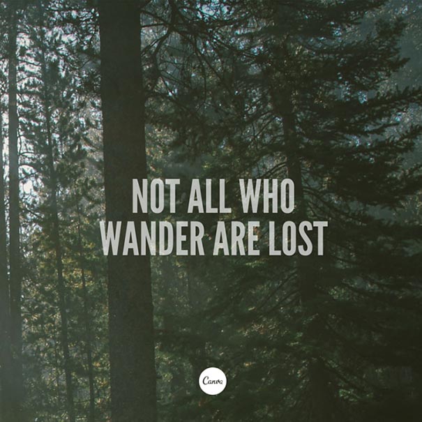
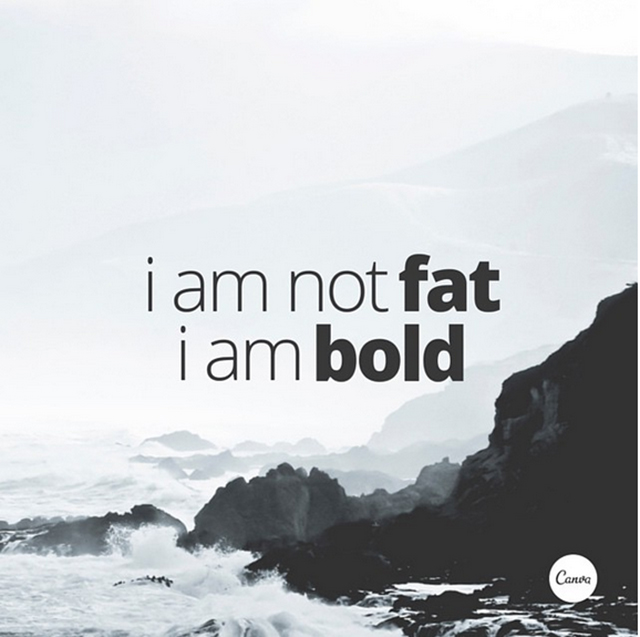
Use Light And Bold Font Variants For Emphasis And Impact

Crop Images To Let Them Act As Background Textures

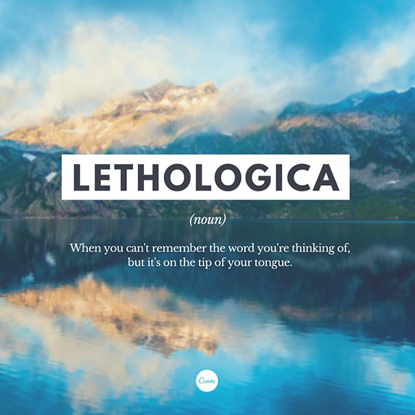
Typefaces Have Personalities Too. Make Sure You Represent Your Message With The Right Fonts

Choose A Geometric Typeface Teamed With An Elegant Serif For A Happy Pairing

Apply A Grid To Create A Clean Composition, Using One Of The Photo Holders As A Text Box

Contrasting Typefaces Make A Great Duo

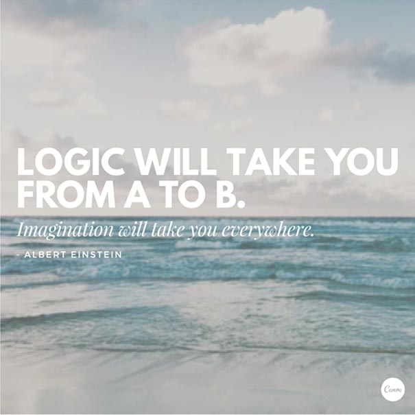
The Placement Of Text Is A Crucial Element. Make Sure To Break Your Lines Up The Way It Should Be Read

Create Clever Compositions By Letting The Features Within Images Guide Where To Place Your Type

Use Shapes To Create Contrast And Offset Your Text From Your Background Image

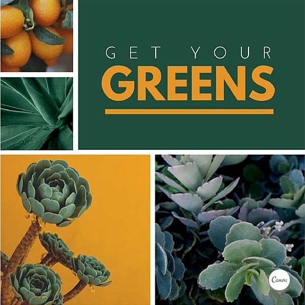
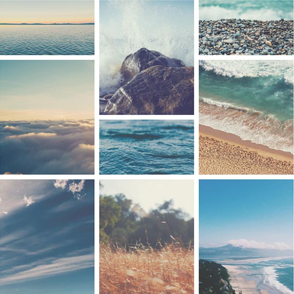
Make Beautiful Collages With Your Favorite Photos Using Grids, Ensure To Apply The Same Filter To Each Image For Consistency

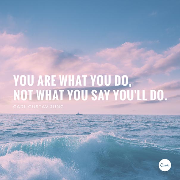
Apply A Tint To Your Image The Same As Any Block Color In Your Design For Consistency

Aesthetics! Composition! Adjust All The Elements In Your Graphic So They Are On Corresponding Angles

Use The Combination Of A Tint And X-process To Create Two-tone Filter Effects

Use Areas With Clear Space In Your Images For Creative Ways To Include Text

Use Strong, Geometric Typefaces To Amplify Your Message.


From HD design to Flat 2.0, this free book explains 10 modern web design trends and how to make the most out of them.

Web Design Book of Trends 2015-2016 is the newest addition to the design library of the wireframing/prototyping app UXPin. This 'web design almanac' takes an in-depth look at today's hottest design trends and their best practices.

With new technology and new tastes, users will expect new web design techniques. Minimalist layouts, long-scrolling navigation, looping HD video backgrounds – these are just a few of the latest trends modern users want to see more of. Equal parts lookbook and 'how-to' manual, this ebook compiles everything into one handy volume.


This 185-page guide spans 10 chapters, each dedicated to a single trend. It's thorough, yet practical and quick-reading. All the points are illustrated in 166 examples from companies including Squarespace, Google, AirBnB, Dropbox, Bauer, and Dribbble.

Topics in the e-book include:

Advantages and disadvantages of each trend

  • How minimalism improves responsive design

  • Evolution of flat design into 'flat 2.0'

  • How to adapt to HD design techniques

  • The dangers of the 'above the fold' myth

  • When to use custom or stock photography

  • The most interesting typography techniques

  • How to use card patterns based on top companies

  • How to add delight with interactions and animations


 Bollywood actor Abhishek Bachchan inaugurated the 16th edition of 'Kala Ghoda Arts Festival' in Mumbai, which is the nine-day festival, it will be celebrate from Saturday 7th February to Sunday 15th February 2015 and It is open to all, free of charge. The festival is conducted over 9 days and across several locations.

In the festival one gets to see an array of events related to music, dance, literature, theatre, street stalls, films, workshops and heritage walks, Literature and Workshops for children as well as adults, is aimed at preserving the culture of Mumbai city.

Abhishek Bachchan, who was accompanied by Bollywood debutant Akshara Haasan, substituted his father and Bollywood legend Amitabh Bachchan who was to inaugurate the festival. Abhishek inaugurated the festival by lighting the ceremonial lamp.

The Kala Ghoda Arts Festival,now in its 16th year, is a community celebration of the arts within one of the most beautiful and historic precincts of Mumbai, The Kala Ghoda Art District.

The Festival has grown exponentially, and is hugely successful, drawing over 150,000 people from all over the city to 350 events over 9 days. Tourists from all over the world plan their trip to Mumbai to witness the Kala Ghoda Arts Festival