Showing posts with label Fine Arts. Show all posts

1. Using System Fonts

01-system-fonts
It’s 2015—wake up and smell the typography. System fonts such as Arial, Helvetica, Georgia, and Times were a staple of web typography years ago, before we had high-speed Internet access and before a new wave of typefaces became optimized for screens. While you can continue to use system fonts, web fonts will add sugar and spice to your site. Consider how TypekitGoogle Web Fonts, and Fonts.com, among others, can help spruce things up.

2. No Fallbacks

02-fallbacks
Web fonts are awesome, but have a backup, or backups. If a user’s browser won’t support web fonts or if the service supplying your web fonts slows down or goes down, you want fallback fonts, such as system fonts. Some web font providers will automatically specify good fallback choices for you. Typekit has two good overviews here and here about how fallbacks work. And even if you absolutely have to use generic system fonts for your site, perhaps because of your budget, make sure to specify fallback fonts.

3. Lack of Variety

03-variety
Too much sameness makes your site dull, and it also reduces usability. Typeface variety should create hierarchy, and hierarchy gives users cues: what’s important, what’s a menu, what’s a headline, and more. But use variety with restraint, and with purpose, otherwise you’ll come off as loud or clumsy. Check out Patrick McNeil’s nice overview of striking web typography for inspiration.

4. Skimping on the Details

04-details-01
News Flash: two hyphens does not make an em dash, a prime is not an apostrophe, and double primes are not quotes. Mind the details, you’re a designer.
04-details-02
The World Wide Web Consortium (W3C) Wiki has a nice listing of alphanumeric and unicode values used in HTML for en dashes, em dashes, quotes, and more. A sample of alphanumeric values are shown above.

5. Tiny Type

05-tiny-type
Does your site’s typography look awesome on a desktop or laptop, but on a mobile device the type has fallen victim to a shrink ray? Chances are you’re using a pixel size, an absolute size, that’s too tiny for smaller, mobile screens. You can size with ems, which are relative, to fix this problem. JavaScript media queries are also a great way to account for different screen sizes, and HOW’s Natalie Boyd gives a primer on them. But if that’s too complicated for you, consider using the viewport meta tag to scale the site and type size depending on the screen size. Make sure you’re testing across viewport sizes: desktop, laptop, tablet, and phone. Tools and education exist online, including Google’s Web Fundamentals and their overview of legible font sizes. And our own Patrick McNeil has a crash course in responsive web design.

6. Spelling & Grammar Errors

06-spelling
There’s no excuse for this, aside from maybe laziness, sloppiness, and/or ignorance. Have your site proofed by a colleague, your client, or the both of them. And if you’re a lone freelancer, use a word processor such as Microsoft Word or Google Docs, for spelling and grammar reviews and corrections.

7. Rogue Fonts

07-pirate
This one’s a biggie. Don’t pirate fonts. Don’t use pirated fonts. Only use fonts that you own, you’ve paid for, and you’ve been authorized to use. Most web fonts run through a third-party server, requiring you to pay for them in order to use them. Specifying system fonts on your site will call them from the users’ computer, where they have the fonts already. But the technically adept designer will know how to take a font file and host it themselves using the @font-face CSS property that calls a WOFF font file from a server. Sure, you could upload a font file you have to your server or your client’s server to do this. But do you own that font? If not, shame on you. And if you did pay for it, do you know if you are authorized to use it on the web, and place it on a publicly-accessible web server? If you’re even a little bit unsure about what you can and can’t do with your font file, read the end user license agreement (EULA) that came with your font. Or contact the company you purchased it from to confirm your usage rights with them. Get in the know about font rights and wrongs, and read Jim Kidwell’s post about how designers get themselves in trouble with fonts.

- See more at: http://www.howdesign.com/design-creativity/fonts-typography/web-design-tips-7-common-web-typography-mistakes/#sthash.I2vgj6zk.dpuf

hrough subtle adjustments, graphic designers can make simple images beautiful and memorable. Poppie Pack, a senior graphic designer at Canva, created 50 excellent graphic design tips communicated with beautiful images that show exactly why those tips work so well. We’ve selected 14 of our favorites to share with you.

For the layman, these images will throw some light on how graphic design decisions are made and how imperceptible some of them may be to the untrained eye.

Use Light And Bold Font Variants For Emphasis And Impact

Crop Images To Let Them Act As Background Textures

Typefaces Have Personalities Too. Make Sure You Represent Your Message With The Right Fonts

Choose A Geometric Typeface Teamed With An Elegant Serif For A Happy Pairing

Apply A Grid To Create A Clean Composition, Using One Of The Photo Holders As A Text Box

Contrasting Typefaces Make A Great Duo

The Placement Of Text Is A Crucial Element. Make Sure To Break Your Lines Up The Way It Should Be Read

Create Clever Compositions By Letting The Features Within Images Guide Where To Place Your Type

Use Shapes To Create Contrast And Offset Your Text From Your Background Image

Make Beautiful Collages With Your Favorite Photos Using Grids, Ensure To Apply The Same Filter To Each Image For Consistency

Apply A Tint To Your Image The Same As Any Block Color In Your Design For Consistency

Aesthetics! Composition! Adjust All The Elements In Your Graphic So They Are On Corresponding Angles

Use The Combination Of A Tint And X-process To Create Two-tone Filter Effects

Use Areas With Clear Space In Your Images For Creative Ways To Include Text

Use Strong, Geometric Typefaces To Amplify Your Message.


 Bollywood actor Abhishek Bachchan inaugurated the 16th edition of 'Kala Ghoda Arts Festival' in Mumbai, which is the nine-day festival, it will be celebrate from Saturday 7th February to Sunday 15th February 2015 and It is open to all, free of charge. The festival is conducted over 9 days and across several locations.

In the festival one gets to see an array of events related to music, dance, literature, theatre, street stalls, films, workshops and heritage walks, Literature and Workshops for children as well as adults, is aimed at preserving the culture of Mumbai city.

Abhishek Bachchan, who was accompanied by Bollywood debutant Akshara Haasan, substituted his father and Bollywood legend Amitabh Bachchan who was to inaugurate the festival. Abhishek inaugurated the festival by lighting the ceremonial lamp.

The Kala Ghoda Arts Festival,now in its 16th year, is a community celebration of the arts within one of the most beautiful and historic precincts of Mumbai, The Kala Ghoda Art District.

The Festival has grown exponentially, and is hugely successful, drawing over 150,000 people from all over the city to 350 events over 9 days. Tourists from all over the world plan their trip to Mumbai to witness the Kala Ghoda Arts Festival

Sand artist Sudarshan Pattnaik wished megastar Amitabh Bachchan for good health in his unique style. He made a four feet high and ten feet long sand sculpture of Big B at the Puri beach in Odisha with the message 'Get well Soon'.

"Puri is famous for Lord Jagannath. I have created the sculpture and prayed to god for the speedy recovery of the Big B," he said.

He also revealed that he used 10 tonnes of sand for this sculpture and took six hours to complete it. His students from his sand art institute helped him in creating an image of the megastar.

Amitabh, who underwent two abdominal surgeries, is still in Seven Hills Hospital of Mumbai but the doctors are satisfied with his progress in health and he might get discharged very soon.


Rembrandt at Artprice. To look at auction records, find Rembramdt's works in upcoming auctions, check price levels and indexes for his works, read his biography and view his signature, access the Artprice database.
 
 Rembrandt Harmenszoon van Rijn was born on 15th July, 1606, in Leiden, the eighth of nine children of Harmen Gerritszoon van Rijn and his wife, Neeltje van Suijttbroeck. He was the first and the only of their sons whom they sent to the school for Latin. After seven years’ schooling (1613-1620), Rembrandt entered the Philosophical Faculty of Leiden University to study Classics. A short period at the university finished with starting a period of apprenticeship (1622-24) under the Italy-trained painter Jacob Isaacszoon van Swanenburgh. However, the succeeding half-year studies under Pieter Lastman, the Amsterdam artist of historical paintings, influenced Rembrandt’s work much deeper.
            In 1625 the 19-year-old Rembrandt returned to Leiden and opened his own studio, which he shared with his friend of the same age, Jan Lievens. Rembrandt executed historical paintings, initially following Lastman’s models: Tobit and Anna (1626), The Ass of Balaam Talking before the Angel. (1626). His physiognomic studies, resulted in numerous self-portraits: Self-Portrait. (c. 1629), Self-Portrait with Wide-Open Eyes. (1630). During his lifetime Rembrandt executed more than 100 self-portraits. He also produced many engravings and etchings.
            The turning point in Rembrandt’s further career was the visit to Leiden of Constantijn Huygens, the widely educated secretary of the governor Prince Frederick Hendrick, who developed great interest in Rembrandt and his art. Huygens’ patronage led to commissions and initial success: two works by Rembrandt were purchased by the English Crown and many copies of his painting Judas Returning the Thirty Pieces of Silver and the Raising of Lazarus were soon published.
After his father’s death on 27th April 1630, Rembrandt moved to Amsterdam, where he settled in the house of the art-dealer, Hendrick van Uylenburgh. Prince Frederick Hendrick bought a number of his paintings and commissioned the Passion cycle, which he would finish in 1639. In 1632, Rembrandt also received the commission to paint a portrait of Dr. Nicolaes Tulp, the famous Amsterdam surgeon. Wining acclaim with this work, Rembrandt became a fashionable portraitist in Amsterdam and started to receive many commissions for portraits of well-to-do patricians. One of his favorite themes, the meditating Philosopher, appeared in his work as early as about 1633. The Prophet Jeremiah Mourning over the Destruction of Jerusalem. (1630): Rembrandt has used the blunt end of his brush to scratch details of the foliage, Jeremiah’s beard and the fastenings of his tunic in the wet paint, a characteristic technique of his early years.
            In 1634, Rembrandt became a member of the Guild of St. Luke, in order that he may train pupils and apprentices as a self-employed master. Rembrandt was popular as a teacher and had a very large and profitable workshop with many student followers, including such outstanding painters as Gerard Dou, Aert de Gelder, Carel Fabritius, Philips Konink, Ferdinand Bol, Govert Flinck and Nicolaes Maes.
            The same year he married Saskia van Uylenburgh, niece of his art-dealer and daughter of a wealthy patrician. Despite their deep devotion and love to each other, their happiness was overshadowed with the deaths of their new-born children and quarrels with Saskia’s relatives, who accused her of squandering money. Of their 4 children only their son Titus, born in September 1641, survived to his adulthood. Titus’ features appear in a number of painting by Rembrandt: The Artist's Son Titus at His Desk. (1655),  Titus. (c.1658).
            As if in plea to let her son live, Saskia died the next year in June. Her death caused a deep crisis in Rembrandt’s life.
During the years of their mutual life Rembrandt created such masterpieces as The Abduction of Ganymede. (1635), The Angel Stopping Abraham from Sacrificing Isaac to God. (1635), The Feast of Belshazzar. (c. 1635), The Blinding of Samson. (1636),  Danae. (1636), The Prodigal Son in the Tavern (Rembrandt and Saskia). (c. 1635), The Night Watch (1642) and others. The Night Watch, maybe is the most famous Rembrandt’s work, and his the largest one (12x15ft; 3.5x4.5m), was commissioned by a company of the Civil Guard of Amsterdam for its assembly hall. The painting is a “recapitulation of the ideals of Rembrandt’s first ten Amsterdam years, and is the last painting in which he strives for brilliant external effects. From now on he set himself the aim of recreating in visual terms the intangible essence of man, his inner life”. In his last two decades Rembrandt simplified his compositions, preferring more classical and stable structure.
            To help the widowed father, two women, Geertge Dircx and, a little later, Hendrickje Stoffels, were admitted in the household. Eventually Geertge caused the artist troubles: at first she repeatedly quarreled with him until at last she brought him to the court (in 1649) on the grounds of an unfulfilled promise of marriage. The second woman, Hendrickje, testified against the plaintiff, and Geertge was sentenced to several years in the prison at Gouda. Hendrickje became Rembrandt’s common-law wife, she sat for many of Rembrandt’s paintings, such as Portrait of Hendrickje Stoffels. (c. 1650) and in 1654 gave birth to their daughter Cornelia.
            Despite numerous commissions, the fees from pupils and the proceeds from etchings, Rembrandt’s debts continued to grow. In 1656, Rembrandt was declared bankrupt. His house and collections were auctioned; however, the sum thereby raised was insufficient to cover the debts. The artist moved into the Roozengracht, where he led a secluded life along with Mennonite and Jewish friends. Titus’ guardian, Louys Crayers, after a long court case, succeeded in having the boy’s part of the inheritance returned to him from his bankrupt father’s estate.

After Rembrandt’s bankruptcy, Hendrickje and Titus (in 1660) set up an art-dealing business in order to provide Rembrandt with protection against his creditors. Despite leading a secluded existence, he maintained many contacts. He continued to keep pupils, and execute commissions, such as the portrait of the board members of the Amsterdam Cloth makers’ Guild The Syndics of the Clothmakers' Guild (The Staalmeesters). (1662); painting of Alexander the Great and a portrait of Homer. (1663). He trained Titus as a painter but hardly any trace of his artistic activities survived. After Hendrichje’s death in 1663 Titus continued the art-dealing business. The paintings of Rembrandt’s last years bear the sad imprint of his unhappy old age and disrepute The Return of the Prodigal Son. (c 1668/69). The dramatic expressions in his last magnificent series of self-portraits reveal an overwhelming ultimate misery and inner torment Self-Portrait. (1669).
 In 1668, Titus married Magdalena van Loo, but unexpectedly died half a year later. One year, which remained for him to live, Rembrandt spent at the house of his daughter-in-law. He became godfather to his granddaughter on 22nd March, 1669. The artist died on 4th October, 1669 without having completed the painting Simeon with the Christ Child in the Temple. 

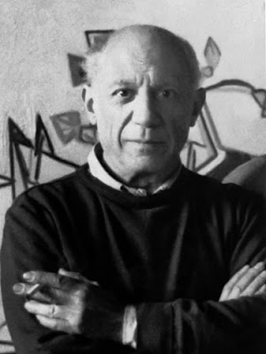
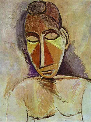
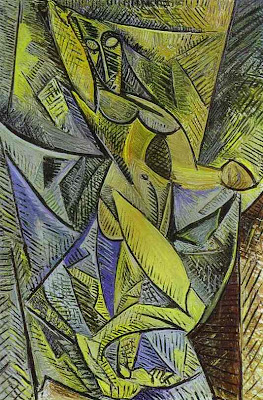
Pablo PicassoPablo Picasso was born on October 25, 1881, in Málaga, Spain. The son of an academic painter, José Ruiz Blanco, he began to draw at an early age. In 1895, the family moved to Barcelona, and Picasso studied there at La Lonja, the academy of fine arts. His visit to Horta de Ebro from 1898 to 1899 and his association with the group at the café Els Quatre Gats about 1899 were crucial to his early artistic development. In 1900, Picasso's first exhibition took place in Barcelona, and that fall he went to Paris for the first of several stays during the early years of the century. Picasso settled in Paris in April 1904, and soon his circle of friends included Guillaume Apollinaire, Max Jacob, Gertrude and Leo Stein, as well as two dealers, Ambroise Vollard and Berthe Weill. His style developed from the Blue Period (1901- 04) to the Rose Period (1905) to the pivotal work Les Demoiselles d'Avignon (1907), and the subsequent evolution of Cubism [more] from an Analytic phase (ca. 1908–11), through its Synthetic phase (beginning in 1912–13). Picasso’s collaboration on ballet and theatrical productions began in 1916. Soon thereafter, his work was characterized by neoclassicism and a renewed interest in drawing and figural representation. In the 1920s, the artist and his wife, Olga (whom he had married in 1918), continued to live in Paris, to travel frequently, and to spend their summers at the beach. From 1925 into the 1930s, Picasso was involved to a certain degree with the Surrealists, and from the fall of 1931 he was especially interested in making sculpture. In 1932, with large exhibitions at the Galeries Georges Petit, Paris, and the Kunsthaus Zürich, and the publication of the first volume of Christian Zervos's catalogue raisonné, Picasso's fame increased markedly.
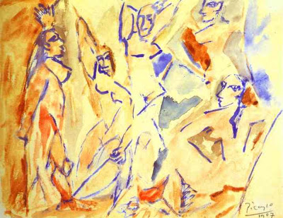
Pablo Picasso
Pablo Picasso
Pablo Picasso
Pablo Picasso


Click here for his biography and his latest works